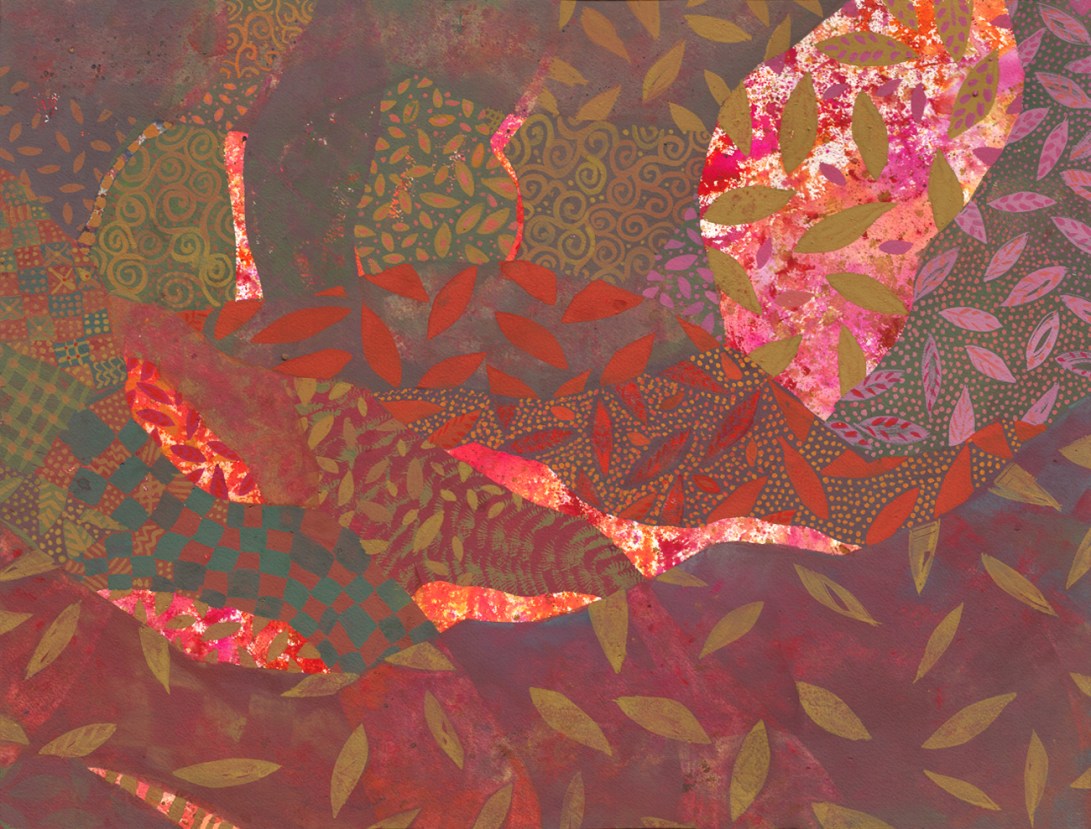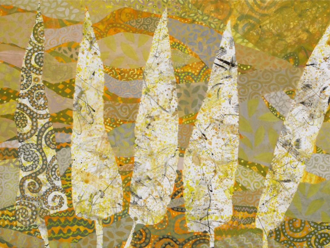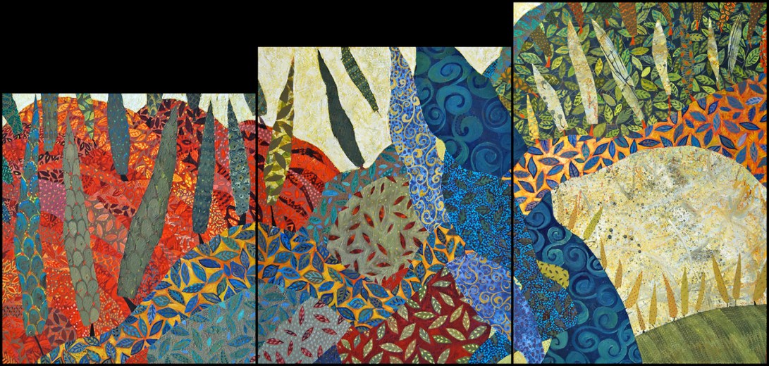
Bab el Wad, 2015 באב אל וואד

DSC_3271
Gouache and multimedia on panels, 46 x 96.5 cm

Bab el Wad in Arabic, Shaar Hagai in Hebrew, the Gate of the Ravine was a battle site during the siege of Jerusalem in 1948.
The sole road connecting the Jewish majority in Jerusalem was cut off here, as it winded up the mountains. The water supply was cut as well, both at the Yarkon springs, and at pumping station within the ravine.

My in-laws met at ages 5 and 8, while waiting on line for their water ration, during on of the pauses in shelling. She was living in her home. He was staying with relatives across the street.

His apartment building was bombed, and the Jordanian army had reached their courtyard. His first grade teacher was on the roof, with a sten gun, and pinned the Jordanians down, to allow the residents to flee in their pajamas, across a rocky field.

The one and half lane road from 1948, is now being widened again, to 6 lanes. So once again we are under siege, from the construction crews.

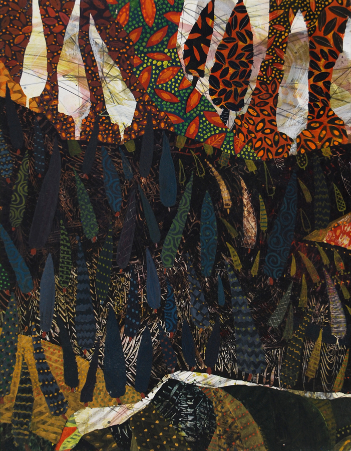
Horror Vacui

Horror Vacui @2015 Chanan Mazal, Jerusalem

Horror Vacui – פחד מן הריק
In visual art, horror vacui (/ˈhɔrər ˈvɑːkjuːaɪ/; from Latin “fear of empty space”), also kenophobia, from Greek “fear of the empty”), is the filling of the entire surface of a space or an artwork with detail.

Gouache, 46 x 61, Dec 2015

A River Went Out of Eden

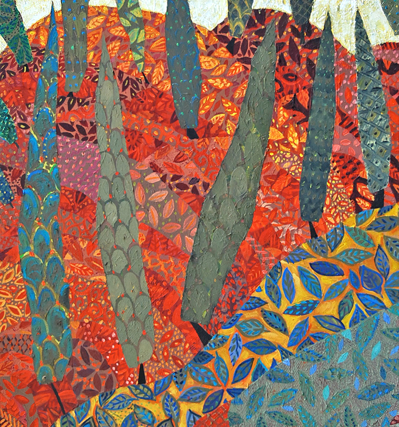
And a River Went Out of Eden 2015 by Chanan Mazal, ונהר יצא מעדן, ציור של חנן מזל

image.jpeg
ונהר יוצא מעדן, להשקות את-הגן; ומשם, ייפרד, והיה, לארבעה ראשים

A river went out of Eden to water the garden, and from there it divided and became four heads. Genesis 2:10

2015, Triptych, oil on canvas 240 x 115 cm.

I had the pleasure of creating this large commission for a young creative family.

The unusual stepped format was chosen to fit the architecture of their home; under a soaring slanted roof, in the dining alcove of an L shaped room.

It is always a challenge to create a composition works well as 3 individual panels and as a unified painting. My greater challenge was to find a way to utilize the stepped heights and abrupt angles.
Cohn-left800
Another creative challenge – and opportunity, was working with collectors, who are themselves artists in other media. Their input was wonderful!

Even if it sometimes required me to “kill my darlings”.

They introduced me to that accurate term used in cinema editing. It means sometimes cutting out a perfect, beloved scene, if it does not effectively move the plot along.

And so I cut. And I cried. And then usually came up with a far better idea.
Some artists refuse to do commissions. They are reluctant to relinquish any artistic autonomy. I sometimes resist any “interference” as well.

But…
If collectors have good enough taste to chose my art from all of the good stuff out there, then they have good judgement. (If I may say so myself)

To be honest, no artist can make consistently best work. People can see the difference. The good works sell. Works that I am not so sure about, even if they are “pretty”, never sell. My collectors, even those with no theoretical knowledge, can sense the difference.

Bottom line:

Four heads joined together to create a new river: Their two heads; my third, and the painting’s fourth, independent mind of its own. All worked to create a happy painting. And the initial requests were mere that it be

“Funky, and with lots of red.”

And cypress trees. The collectors also like cypresses.
 

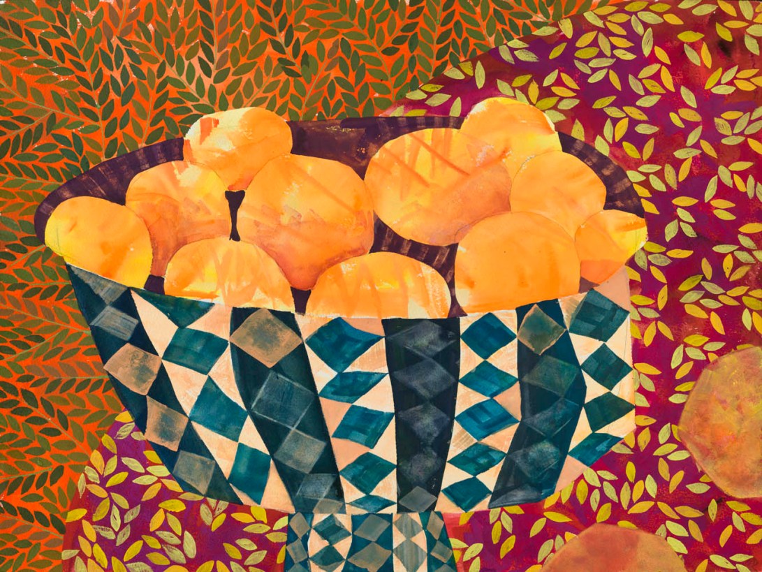
Bronx Oranges

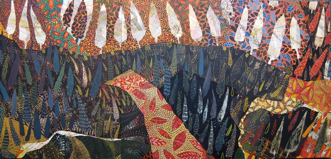
Bronx Oranges by Chanan Mazal

Bronx Oranges 2011, Gouache
SOLD and in its new home… back in the Bronx!

Why “Bronx”? Something about the patterns and colors reminded me of Art Deco textiles and housecoats.

Before every Passover, my grandfather sewed housecoats for the young ladies of his household. I once found a bag of rags in the attic, along with other shmattes from my grandmother’s apartment. I asked if I should throw it out. But my matter-of-fact mother rediscovered them with joy, as the patterns and colors of the 1920s, 30s and 40s brought back sweet memories.

I shared with my collector an observation about my work: I always sell works that were a watershed, enabling a big discovery and change in style. So I complemented her sharp eye. As she narrowed down her selection, every single piece fit into that category.

Who Let the Genie Out of the Bottle? Dec 2015

image Gouache over watercolor and gold acrylic, painted on a board coated wth white clay.45 X 90 cm.
These paintings inspired by flasks from the Islamic Art museum started out much less optimistically. This one expresses the celestial wonder that I once felt when discovering the Persian art tradition, before the chaos began.


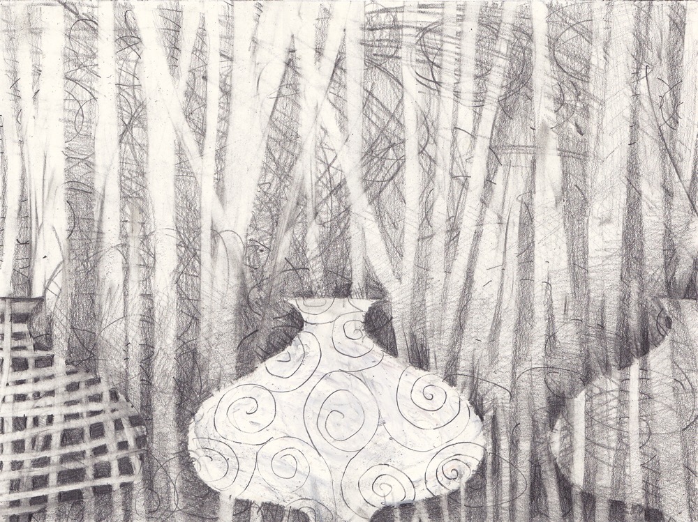
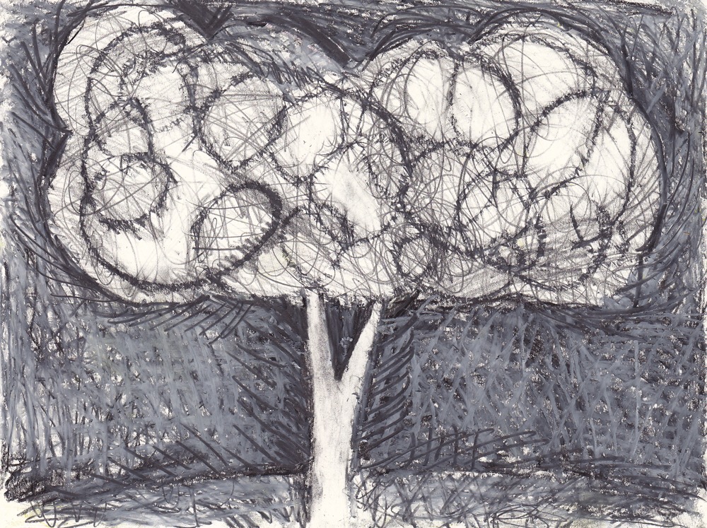
Getting Back into Pencil

Changing media is aways a refreshing way to rediscover creativity.

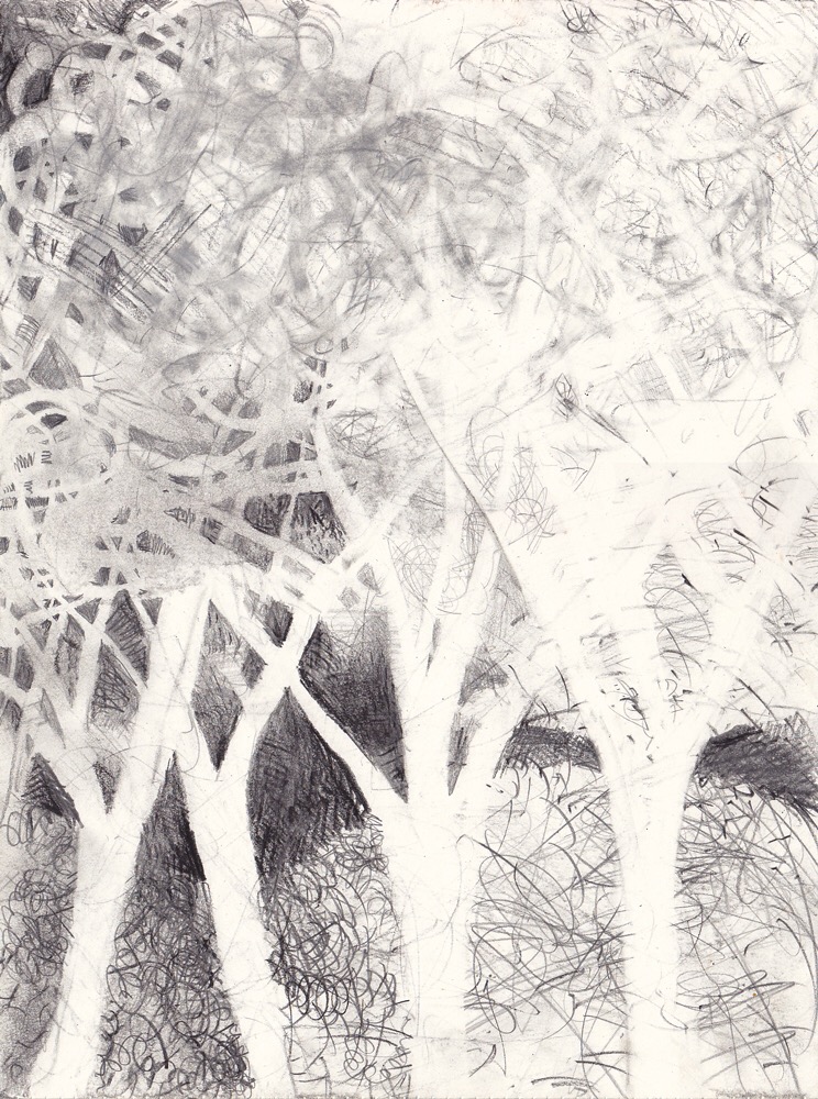
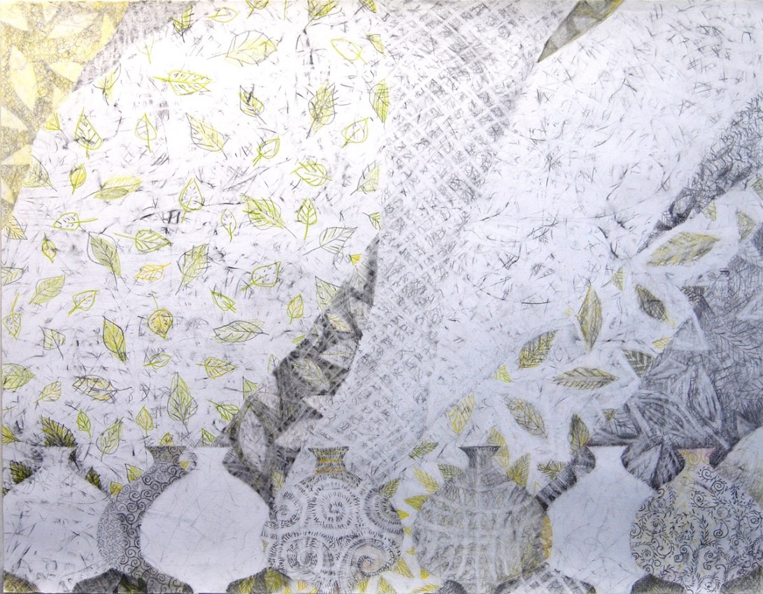
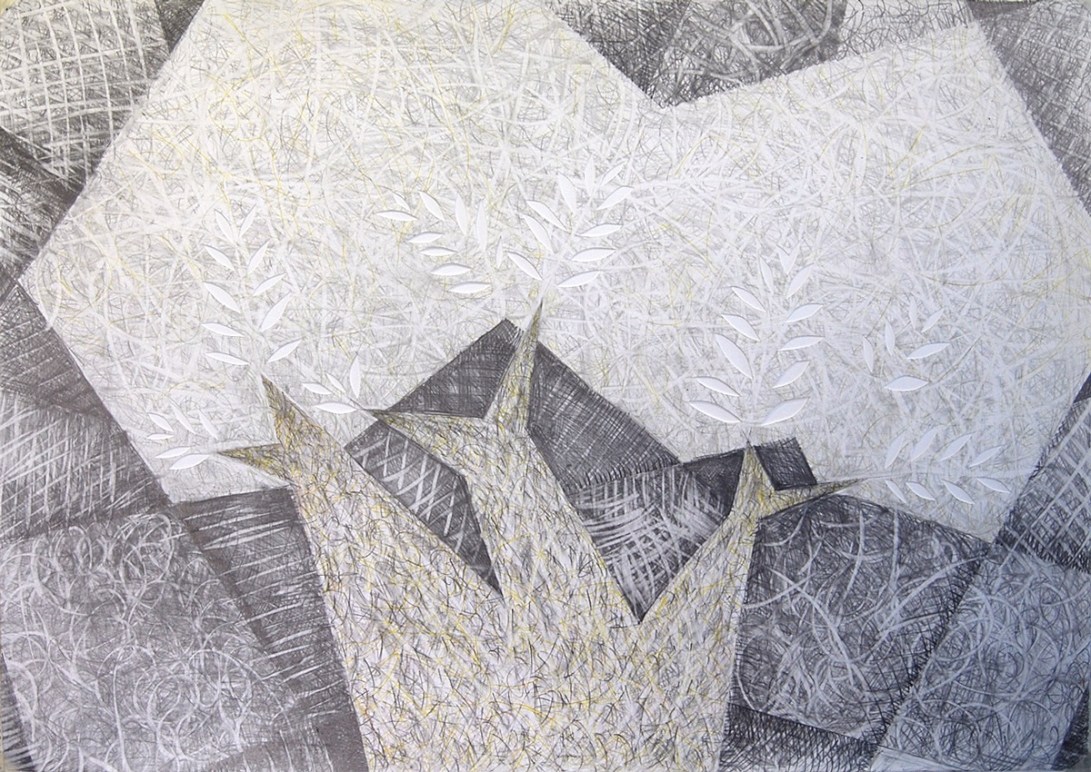
My goal was to investigate ways to use plain old graphite to make color, and especially how to use the white of the paper as a primary subject matter. Therefor, I stuck with my familiar old images, trees and bottles. (I also did many abstracts, but the figurative works were more inventive.)

I often tell my students that the “topic” of an artwork can be trivial. The true art is in the story telling. A phenomenal plot can be killed by a trivial or boring writer. A great play can be killed by a monotonous reader, with no sense of timing. An overdone fairytale, can have all of its drama and suspense returned by a natural storyteller.

So paper, tell your story!

IMG_1651

IMG_1653

IMG_1649

IMG_1650

IMG_1654

IMG_1652

IMG_1655

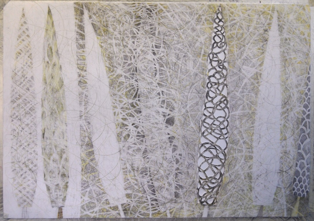
On Trees and Frugality

TreesDec2015-800

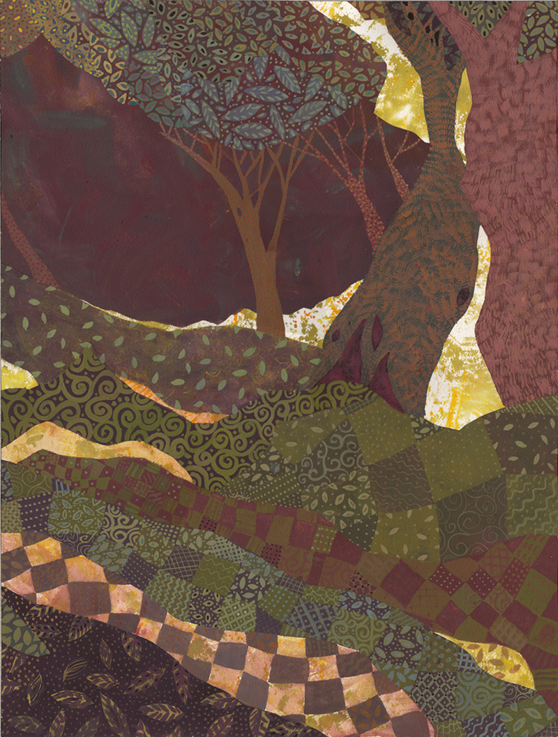
Trees, 2015. Gouache on paper, 46 x 61 cm.
עצים, גואש 46 * 61

I have been lazy about scanning my work recently and I have a big backlog. I skipped fast forward to this one, and will post a large commission later.

Once again, the palette was determined by my being frugal: I sliced open a bunch of dried out paint tubes, and used the crumbs. If I exhibit this, should I write that in the catalog?

I just allowed myself to get lost in the richness.

My Work at the Jerusalem Biennale 2015

DSC_2879
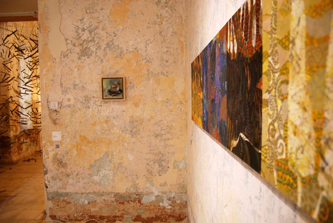
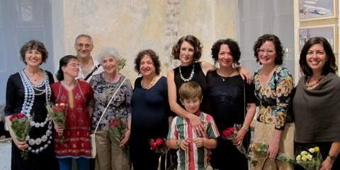
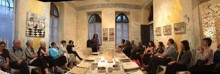
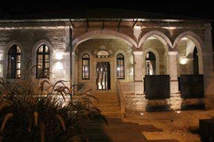
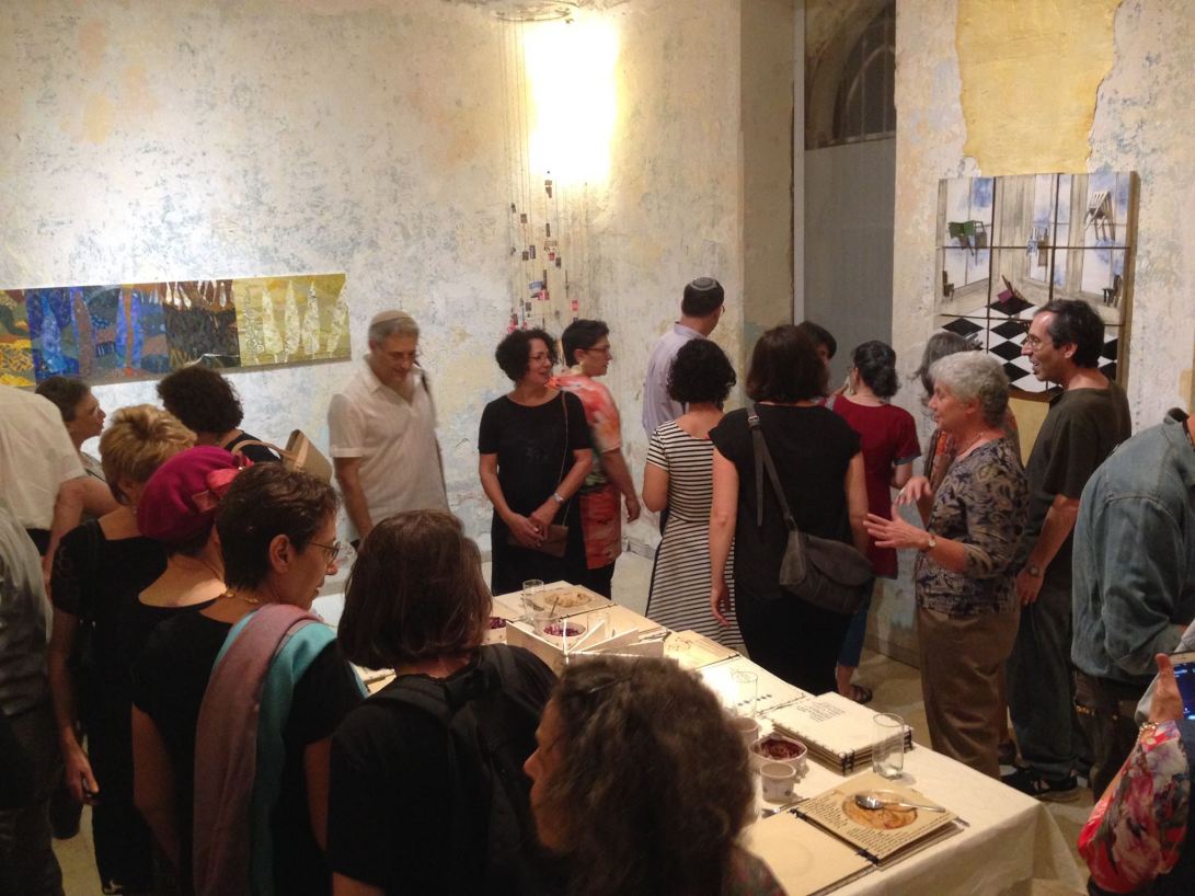
I am honored to participate in this years Jerusalem Biennale – in the group show “A Sense of Space, A Sense of Place, curated by my talented colleague Mallory Serebrin. The show is in a unique location – a century old Armenian villa, that served for half a century as a school for deaf children. The exterior is magnificent. The interior – reminds me of my artwork! The work is a polydych, of four panels, called “Common Cypress”, the botanical name of the Mediterranean cypress. In Hebrew – ברוש מצוי Each panel is named buy a line from a song of the Israeli cannon, revealing a strong connection to this unique place.

Brosh-Matzui-A2000

Hamsin

בחמסין בקרה – מ”ברוש” של אהוד מנור ואריאל זילבר

Bab-el-Wad900

באב אל ואד – מילים חיים גורי

Numa-Eretz900

נומה עמק ראץ תפארת מ”שיר העמק, מילים נתן אלטרמן

Me-eretz-Merhakim900

מארץ מרחקים מ”אל הציפור” מילים חיים נחמן ביאליק

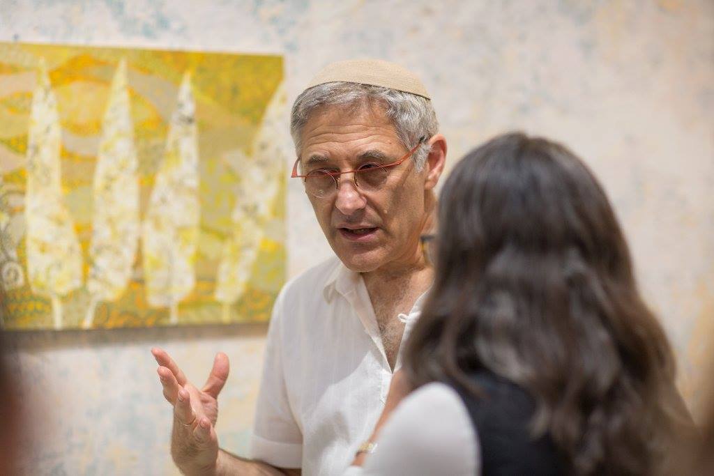
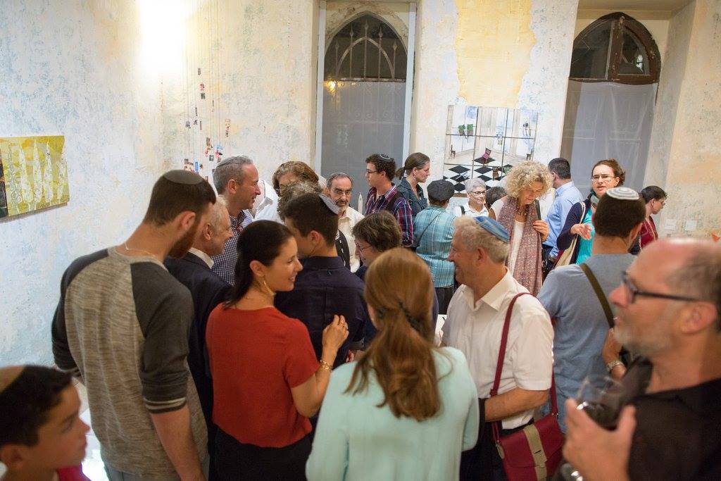
Images from the Gallery Talk

12113492_1020364467995615_4416441540934649578_o 12110009_1020364151328980_7839365100354067886_o 12031611_1020364084662320_829005038689059029_o 12027771_10153330616087408_8105636286069934071_n 10906459_10153609102248607_2712955218711766038_n

DSC_2877

DSC_2891
12038084_10153634649308610_5491917141575623502_n 12002376_10154306512039126_8357194304920433249_o

Curious Yellow

DSC_2780-650

Cypress Trees in Late Summer Fields 2015

Gouache over mixed media, on a koalin coated panel. 41 x 66 cm.

ברושים בשדות סוף הקיץ 2015

גואש מעל מדיות מעורבות, על לוחות המצופות בחימר לבן. 46 5* 66 ס”מ

Yellow is a tricky color. It is easy to paint monochromatic works in all greens, blues or reds. One simply mixes in small amounts of other colors to gain a wide pallet, of varying depths and intensities and pureness. There are also many and so very different pigments in those families to start from. Yet, after all of that messing and punching and kneading, these colors easily remain what we consider to be the families of greens, blues and reds.

Yellows are so much more sensitive! How do we create a “dark yellow”? After adding what miniscule amount of another color, does the “yellow” stop being yellow? Very little!

So, how much must I stray away from that Crayola crayon definition of Yellow, to create a vibrant painting, with sufficient contrasts?

Those of us living with our bone dry summers are familiar with this pallet. The wild grass turns to dusty yellow. The red roofs  and dark cypresses are coated with fine yellow gray loess soil, carried in from the Sahara and Syrian Desert.

Yet our summer is not merely sun burnt. Delicacy can be found in the dried thistles. The rhythmic curvatures of the rolling hills and terraces reveal themselves. The sun casts yellow, and shadows in the hills reveal a lavender hue.